
SlickShift Before After Slider
Product media
Screenshots
Overview
About this App
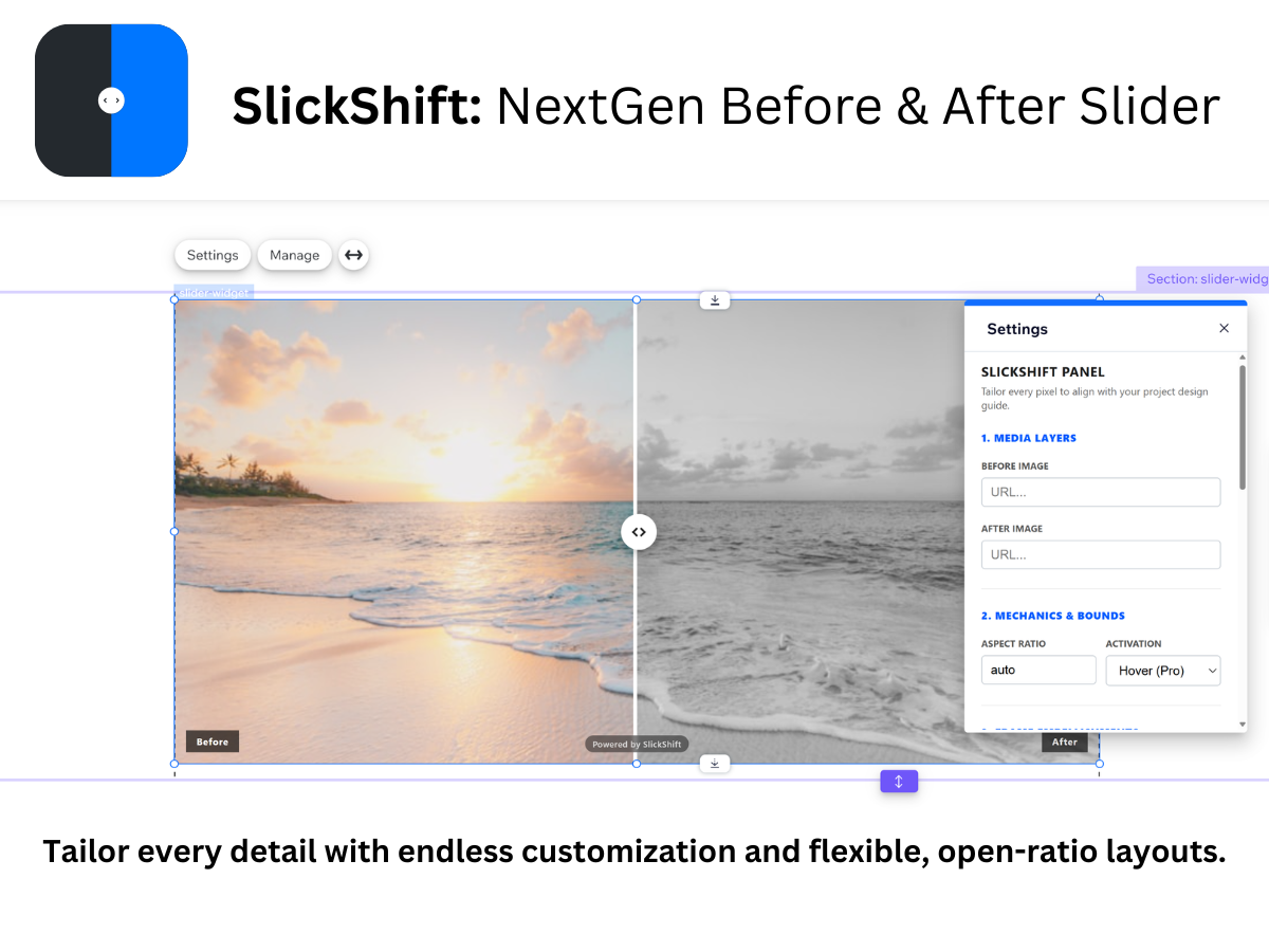
SlickShift offers a flexible visual comparison tool designed to fit cleanly into modern website layout grids. Built to accommodate a variety of showcase needs—including home renovations, medical transformations, design overhauls, photography presets, and auto detailing—it displays side-by-side images while respecting native aspect ratios. Developed as a lightweight browser web component, SlickShift is optimized for efficient loading to help maintain site performance and reduce potential layout shifts. Visitors can interact with comparisons using a standard drag interface or a responsive hover-tracking mode. Comprehensive styling controls also allow adjustments to borders, color palettes, labels, and typography to align closely with existing design guidelines.
What the listing highlights
- Fluid & Responsive Layouts for All Builders
- NextGen Hover-to-Reveal Interaction Mode
- Case-Sensitive Custom Text Banner Labels
- Deep Customization: Borders, Colors & Fonts
Additional product media
Promotional media
Reviews
Official Wix marketplace summary
Wix Marketplace feedback
No reviews yet.
Plan comparison
Pricing & Plans
SlickShift Pro
$3.99 / month
$47.88 billed yearly Save 20% yearly$4.99 / month
- Unlock Advanced Hover-to-Reveal Mode
- Complete Watermark & Branding Removal
- 100% Fluid Breakpoint Layout Freedom
Detailed App featuresCompare all 8 structured features
| Feature | Paid planSlickShift Pro |
|---|---|
| Essential Styling ControlsCore design settings to adjust divider line thickness, handle color, and starting slider position to align with basic page layouts. | Included |
| 100% Fluid & Responsive Layouts for AllAutomatically adapts to any viewport breakpoint or website builder grid without distorting native image aspect ratios or causing layout shifts. | Included |
| Deep Customization: Borders, Colors & FoProvides granular design controls to match any brand system, allowing full customization of border weights, color palettes, typography choices, and corner radii. | Included |
| NextGen Hover-to-Reveal Interaction ModeDelivers a frictionless, physics-backed cursor tracking experience that smoothly reveals visual transformations as visitors move across the image canvas—no clicking or dragging required. | Included |
| Classic Touch & Drag SliderIntuitive, touch-friendly divider controls that allow visitors to manually slide across images on desktop and mobile screens. | Included |
| Native Aspect Ratio PreservationDisplays your comparison images in their true dimensions without force-cropping, stretching, or triggering layout shifts. | Included |
| Lightweight Web Component ArchitectureFast-loading, zero-dependency script optimized for quick page speeds and easy single-domain implementation. | Included |
| Case-Sensitive Custom Text Banner LabelsMaintains complete typographic control over "Before" and "After" labels, preserving exact styling preferences, including lowercase, camelCase, and custom brand formatting. | Included |